


Interpretation of remotely-sensed satellite data is the story uncovered when looking at data in various and detailed ways. To "analyze" data is to take them apart to discover their nature, proportion, function, interrelationships, and so on. "Interpreting" the data is explaining their meaning.
Many visualization tools include built-in routines for analysis to visually enhance image data making specific features easier to see and understand. Analysis tools, whether built-in or stand-alone, offer a variety of measurement options. And, the addition of geographic information systems (GIS) to the analysis toolbox allows discovery of interrelationships between layers of data added to the GIS map.
Since April 1999, NASA's Earth Observatory has offered interpretions of satellite imagery from many remote-sensors on many environmental satellites. The Earth Observatory staff uncovers and tells the stories. Many archived stories are available for the user to find, and more are added every day. Students can use the Earth Observatory's library of image intepretations to support their own research projects.
In Using Satellites in Education, procedures are presented for students to find for themselves project-specific data sets, then visualize and analyze those data. The panels below suggest methods for interpretation. In such activities, students become active searchers for evidence-based conclusions while engaging and demonstrating the Science and Engineering Practices of the Next Generation Science Standards.
Some techniques of image interpretation:
The panels include the use of tools already presented in Accessing Data and Visualization and Analysis, demonstration of the NGSS Science and Engineering Practices when learners engage with such data, and sample lesson plans from the SEA Lesson Plan Library that employ the type of analysis and interpretation discussed.
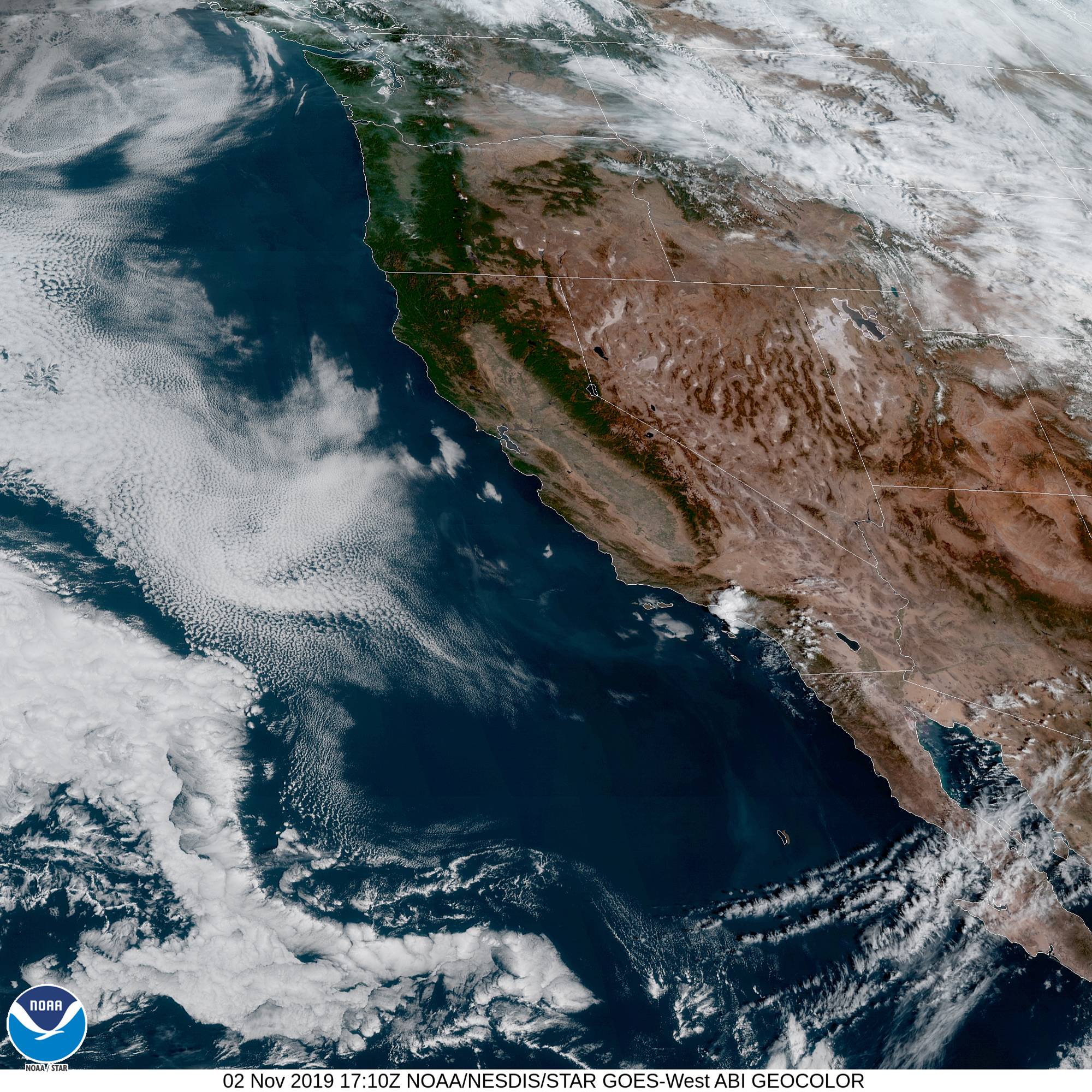
Recognizing patterns such as landform shapes and colors is perhaps the simplest and most common mode of interpretation of remote-sensing data from environmental satellites. One of the first things that comes to mind when a viewer sees an image is the recognition of familiar shapes and colors. This GOES-17 image from November 2, 2019 (click image to enlarge) shows southwestern United States and part of Mexico. Those who have used maps or an Earth globe in school will readily recognize California and Baja California. This false color image also highlights the San Joaquin Valley of California, Sierra Nevada mountain range and the Sonoran Desert. It is not difficult to identify bodies of water including the Pacific Ocean, Gulf of California, Salton Sea, Lake Mead, Great Salt Lake, Lake Tahoe, and Mammoth Lake. San Francisco Bay and the Channel Islands of Southern California are also easily located. Sharp eyes might pick out the Grand Canyon. How many types of clouds can be identified in this image? Is that seemingly isolated puff of cloud over the Los Angeles basin bringing moisture relief to the surrounding fire areas? Image source: NOAA GOES Image Viewer
Sample Lesson: Landforms
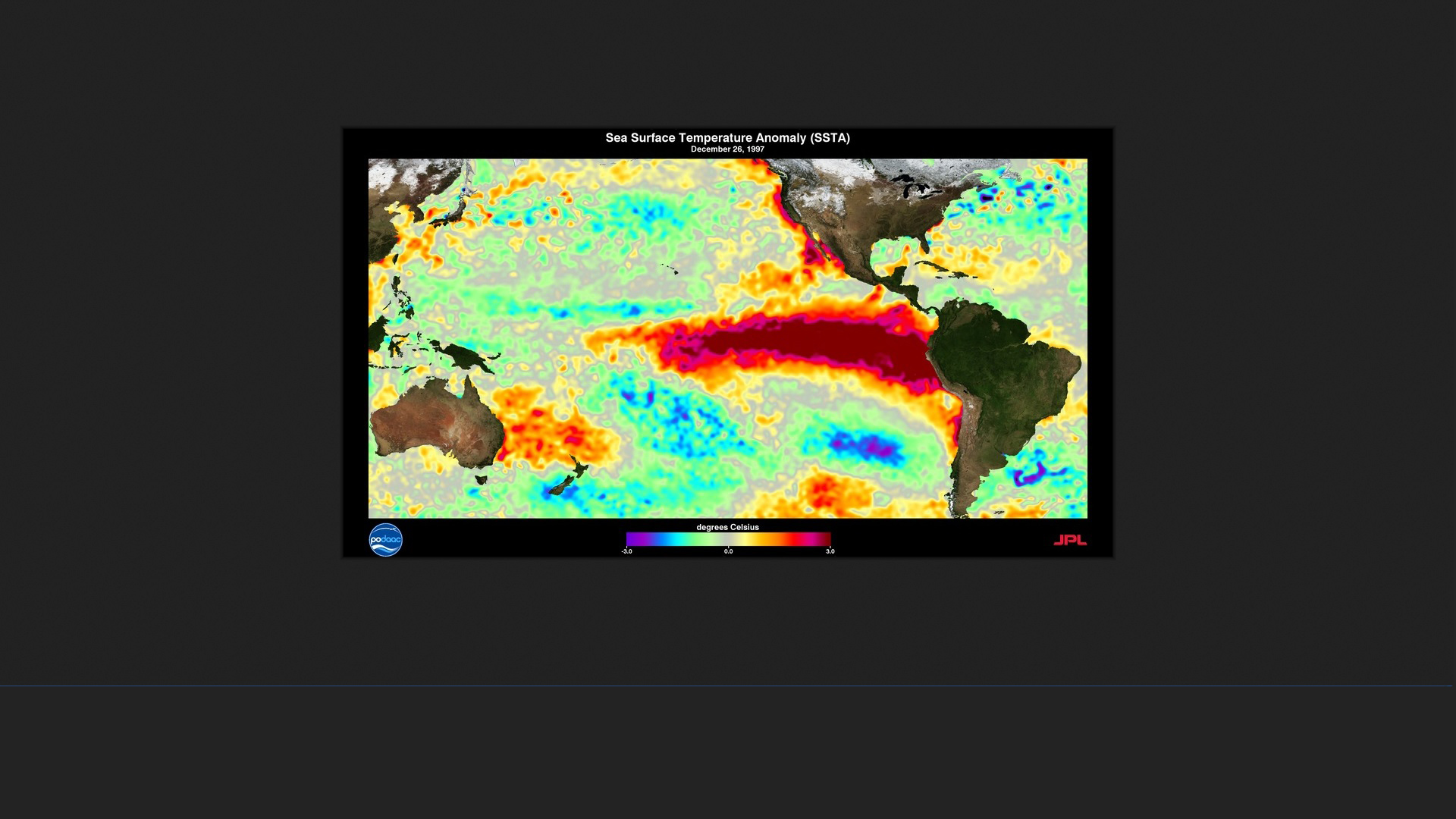
In this world map (click image to enlarge), the outlines of the continents are certainly recognizable. In the ocean areas, the Reynolds plot of sea surface temperature anomalies averaged for the month of December 1997 clearly shows a "tongue" of warmer water stretching westward across the Eastern Equatorial Pacific Ocean. This is the condition referred to as "El Niño." The term is thought to originate with Ecuadorian fishermen who describe these warmer water conditions in December of some years. The El Niño condition alternates with a similar, colder water anomaly named "La Niña." The entire cycle, called El Niño Southern Oscillation (ENSO), is a major player on the world stage of changing weather patterns and climate. Plot source: Physical Oceanography Distributed Active Archive Center (PO.DAAC) at NASA Jet Propulsion Laboratory using Scientific Visualization Studio at NASA's Goddard Space Flight Center
Sample Lessons: What is El Niño? Part 1, Part 2, Part 3
.jpg)
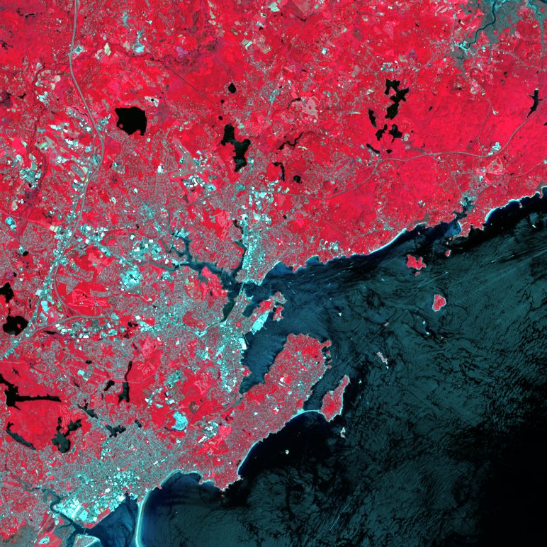
This Landsat 8 image (click image to enlarge) of the Massachusetts coastal area north of Boston in 2018 is a false color image. The forested areas appear red in color while the culrtural features such as buildings, roads, and cleared areas, appear cyan in color. The image was produced using a Landsat 8 data set consisting of 11 separate waveband images, cropped with ImageJ and viewed with MultiSpec for this page. In this image, only the image data for the near infrared (Band 5), visible red (Band 4), and visible green (Band 3) wavebands are displayed. With MultiSpec, the near infrared waveband (normally invisible to the human eye) was assigned to be displayed as red on the computer monitor, the visible red waveband was assigned to the monitor's green channel, and the visible green waveband was assigned to the blue channel. The forested areas normally appearing green to the human eye appear red in this image while cultural features appear cyan (blue-green). That means the forested areas (surface features containing chlorophyll-a) are reflecting a lot of near infrared radiation while cultural features like buildings and roads do not.
Sample Lesson: How Landsat Works
The bottom image (click to enlarge) from Landsat 8 on October 21, 2019, is similary processed for this page. It shows the Los Angeles basin and parts north. Note the red-brown area. This is the fire scar from the Saddle Ridge Fire. According to the California Department of Forestry and Fire Protection, this fire covered 8799 acres and was 97% contained on November 1. The Palisades brush fire nearer the coast is still active as evidenced by its smoke plume. In this image, the shortwave infrared data (Band 7) was assigned to the monitor's red channel, near infrared (Band 5) was assigned to the green channel, and deep blue data (Band 1) was assigned to the blue channel. Shortwave infrared seems to be reflected more by the dry earth of the burned area. The green color in the image indicates near infrared reflected by green vegetation - green forested hills and yellow-brown shrub areas. The deep blue data of Band 1 is mostly reflected by coastal waters of the Pacific Ocean and some aerosols like fire smoke.
Sample Lessons: How Landsat Works and
GloVis - USGS Global Visualization Viewer.
Image data source for both images: USGS using GloVis Global Visualization Viewer.
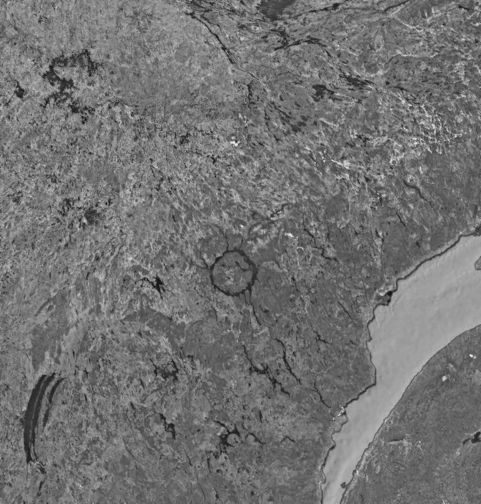
In the late 1980s, students in a high school Earth and Space Science class built a weather satellite direct read-out station in their classroom. The station received facsimile signals directly from NOAA polar-orbiting weather satellites and imaged the signals in real-time on an old-style, electrostatic facsimile printer. This image adapted from Google Earth is similar to one they received (click image to enlarge). Their curiosity was piqued by the circular pattern they saw in the image. What was it? How did it come to be? Was it of human construction? Was it a meteor or volcanic crater?
The teacher seized the teachable moment and led the students in a brainstorming session to generate a list of reasonable questions for investigation. The class was divided into small groups; each group investigated one of the questions. During the group investigations, the circular pattern in the image was measured, a Geography teacher was consulted for maps and references, and meteor strikes of the past were researched, among other things. One group encountered documents in French and turned to students in the class who were studying that language. As groups reported back to the class, their investigative processes were described and information was offered for addition to the overall class data. A lively class discussion ensued duirng which each new piece of information was assessed and its relation to the questions determined. Ultimately, the students concluded this was Manicouagan Reservoir in the Canadian Province of Québec. It was formed by an asteroid about 5 km (3 miles) in diameter that struck the Earth about 215 million years ago. The entire crater is about 100 km (60 miles) across.
Since this is one of the largest meteor craters on Earth, it is also one of the most photographed from Earth, air, and space. Nonetheless, this teacher led students on a journey of discovery during which they demonstrated all 8 of these NGSS Science and Engineering Practices:
Teachers are encouraged to review the Next Generation Science Standards, especially the Science and Engineering Practices, for guidance in helping learners interpret satellite-based, remote-sensing environmental data.
Teachers are invited to explore the SEA Lesson Plan Library to find lesson plans for learners in grades K-12 related to satellite technology and satellite-based remote-sensing. Each integrated STEM lesson addresses Next Generation Science Standards.
Each lesson plan includes Teaching Notes and Student Activity pages.
The Teaching Notes consist of these sections:
The Student Activity pages contain some or all the following as needed for the individual lesson:
Complete lesson plans can be downloadable in PDF. A competent PDF reader such as Adobe Reader or equivalent is required to read and print the lesson plan. The Student Activity pages are additionally provided in Microsoft Word DOCX format allowing the teacher to more easily adapt the the lesson to the individual needs of students, curriculum, and classroom situation.
You can search for lessons addressing Next Generation Science Standards by grade level, subject area, Science & Engineering Practice, and/or Crosscutting Concept. The Library can also be searched by lesson title or by National Science Education Standards addressed.
Every lesson was created by educators skilled in the use of satellite technologies in the classroom. Each plan is reviewed annually by the SEA Lesson Plan Library staff to update content and links as needed. The SEA Lesson Plan Library is supported by the Satellite Educators Association membership. All lesson plans in the SEA Lesson Plan Library can be accessed, used, and adapted without charge.
You are invited to visit the SEA Lesson Plan Library for more information the library, its lesson plans, the Next Generation Science Standards, the National Science Education Standards, and how to use the library's search tools to help you find lessons.
You are invited to explore these areas in sequence or skip to the topic of greatest interest: